
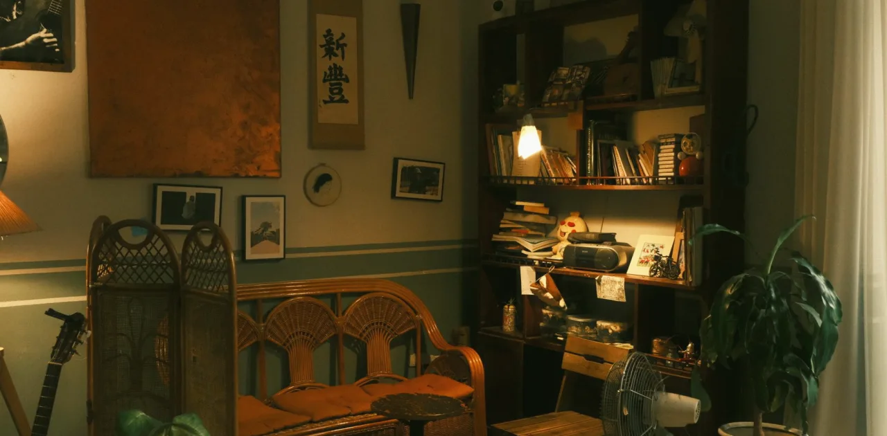
How Deep Should a Backdrop Be? A Question We Hear Every Week
The question we hear most about background design is how much to put behind the speaker. Here is a plain answer built around depth, spacing and restraint, with a few ways to test it.
The question behind the question
Students rarely ask about depth in those words. They write something like: my wall looks empty on camera, so what should I put there? Underneath is a worry that a plain wall looks unfinished while a busy one looks messy. Both worries are fair, and the answer sits between them.
In the Background Design module we start from a simple idea: the wall behind the speaker is a supporting actor. It should add a sense of place and a little depth, then step back. If a viewer remembers the shelf more than the guest, the design has taken too much of the frame.
So the useful question is not how much to add but how much the camera can comfortably carry. That depends on lens, distance and the size of the picture the viewer sees, and each of those can be checked with a sketch and a test frame before anything is bought or moved.
Distance does most of the work
The single most helpful habit is to separate the speaker from the wall. A person seated almost against a surface looks flat, and every mark on the wall competes with their face. A gap of a few feet lets the background soften slightly and gives the picture layers: speaker, middle ground, wall.
Many learners work in small rooms where this feels impossible. In that case we sketch the layers differently, using a shelf that stands proud of the wall or a panel set at an angle to suggest depth. Even a modest gap changes how the frame reads.
When you measure the room in the first module, note how far the chair can move from the wall without blocking a door or losing the camera position. That number shapes every later choice, and it is easy to forget until a layout plan is half drawn.
- Measure the gap between chair and wall before planning anything
- Aim for visible separation, even if it is small
- Check the frame from the camera, not from the doorway
Shelves: fewer objects, clearer groups
A shelf is the most common answer to an empty wall, and also the most common cause of clutter. The trouble is usually quantity. Twenty small things read as noise at video size, while three or four grouped objects read as a considered corner.
We teach a simple method on paper. Divide the shelf into zones, give each zone one tall item, one low item and some empty space, then leave a section of the wall clear. Empty space is part of the design, and it gives the eye somewhere to rest.
Colour matters here too. Keep the shelf within the palette from your mood board, so that books, ceramics and plants echo the warm neutrals rather than fight them. If one object feels loud in a test frame, take it out and look again before deciding it belongs.
- Group objects in twos and threes
- Keep a clear stretch of wall beside the shelf
- Remove anything that draws the eye before the face does
Panels and wall treatments for plain rooms
Not every room suits shelving. Rented spaces, shared offices and corners of living rooms often need something lighter. Here we look at panels, fabric hangings, a painted section or a framed grouping that adds texture without permanent changes.
The principle stays the same: one considered element beats several half-committed ones. A single wide panel in a soft neutral can give a wall enough character to look intentional, particularly when a lamp or plant sits in front of it at a different height.
We also discuss scale. A small picture on a large wall looks lost on camera, and a very large pattern can shimmer or distract. Sketching the wall to scale, with the camera crop drawn over it, shows these problems before anyone picks up a drill or a paintbrush.
Testing the frame before you commit
A background that looks good in the room can behave differently through a lens. So we ask learners to take a test frame at the real camera height, seated in the real chair, and look at it at the size a viewer will see it. A phone held at arm's length is a fair stand-in for a small screen.
Look for three things: lines that appear to grow out of the speaker's head, bright spots that pull attention, and areas that feel heavy on one side. Each has a small fix, often moving an object a hand's width or turning a lamp slightly.
Repeat the test after any change, and keep the photographs together. Comparing two frames side by side is far more reliable than trusting memory, and it gives you a record to bring to a design conversation if you want a second opinion.
- Shoot at camera height, with the speaker seated
- View the frame at small size
- Compare before and after, side by side
What to bring to the next lesson
If you are working through this module, come with a few things ready: two or three photographs of the wall behind your usual seat, a rough measurement of its width and the space in front of it, and a note of any fixed items such as sockets, windows or radiators.
Add a short list of what you would like the viewer to feel. Calm, curious and welcoming are good starting words, and they guide choices more than any rule about shelf counts. We will turn the list and the measurements into a first sketch together.
Nothing needs to be bought at this stage. The aim is to arrive with a clear picture of the wall as it is, so that every change you plan has a reason behind it and a place on the page.
There is no fixed amount of background that suits everyone. A good backdrop has some distance behind the speaker, a few grouped objects, a calm palette and room to breathe. Start with a sketch, test it through the camera, and change one thing at a time. If the face is the first thing a viewer notices and the room feels welcoming, the design is doing its job.
Keep reading
-
Where Chairs Go: Seating Distances and Sightlines in the Furniture Placement
A look at how the Furniture Placement module handles spacing, angles and sightlines for one, two or three people on camera, and what learners bring to it.
-
Layout Plan Mistakes That Make a Setup Day Harder Than It Needs to Be
A scaled layout plan only helps if it matches the real room. Priya Nair walks through the slips she sees most often and how to avoid each one before setup day.