
What a Colour Palette Really Means on an Interview Set
A plain-words guide to the terms behind colour and mood boards: undertone, value, accent and saturation, and how each one behaves once a camera is pointed at your wall.
Why the vocabulary matters before the paint
When people first sit down to plan a recording space, they often say they want it to feel warm. That is a fine starting point, but a camera does not read feelings. It reads value, undertone and saturation, and a handful of trade words describe those three things clearly enough to plan with. Once you can name them, a mood board stops being a pile of pretty pictures and becomes a set of decisions you can check against a real wall.
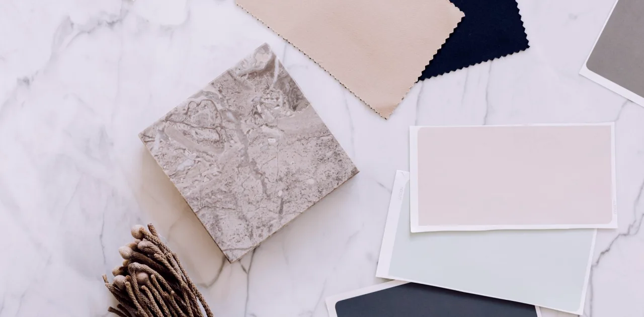
In my classes I introduce these terms in the first colour session, usually with a table covered in paper swatches and a phone for photographing them. The point is not to memorise jargon. The point is that a word like undertone lets you explain why two beiges look different on screen, and why the one you loved in the shop looks faintly green behind your guest.
Undertone: the hidden colour inside a neutral
Undertone is the quiet hue underneath a neutral. A cream may lean yellow, a grey may lean blue, a taupe may lean pink or green. Under daylight you may barely notice it, but a camera with a fixed white balance can push it forward, and a wall you thought was plain suddenly looks tinted. The simplest test is to hold a sample against a sheet of clean white paper and ask what colour the neutral seems to be borrowing.
For warm neutral palettes, I suggest choosing one undertone family and staying inside it. If the wall leans warm, the wood, the fabric and the shelf objects should lean warm too. Mixing a pink-leaning sand with a green-leaning stone is where frames begin to feel slightly off, even when no one can say why.
- Test samples next to white paper, not next to other colours
- Photograph swatches under your actual recording light
- Keep one undertone family across wall, wood and fabric
Value: how light or dark a colour reads
Value describes lightness, independent of colour. A pale oatmeal and a deep walnut can share an undertone and still sit at opposite ends of the value scale. On camera, value does the work of separating a speaker from the background. If your guest wears mid-tone clothing and the wall is also mid-tone, the edges of their shoulders dissolve and the frame feels flat.
A useful habit is to take a swatch photograph and switch it to black and white. If the colours collapse into one grey, they have the same value and will not give you depth. A gentle step between wall, furniture and person, perhaps three distinct values, tends to look composed without any extra effort or decoration.
Saturation and the accent colour
Saturation is how strong or muted a colour is. Warm neutral boards lean on low saturation, which is why they feel calm, but a frame made entirely of muted tones can read as dull. This is where an accent comes in: a single object or small area in a more saturated colour, such as a rust ceramic, a deep green plant or a mustard book spine, that gives the eye somewhere to rest.
The working rule I teach is to keep the accent small and repeat it once. One rust vase on the left shelf and a rust cushion on the chair close the loop and make the choice look intentional. Three or four accents in different colours start to compete with the guest, and the face is meant to be the most interesting thing in the shot.
- Choose one accent colour per frame
- Repeat it once, at a different height
- Keep it smaller than the speaker's head in the frame
Reading a mood board against your guests and camera
A mood board earns its place when it answers practical questions. Who sits in this chair, and what skin tones and clothing colours will pass through it? What is the topic, and does the palette suit its tone? A conversation about family history can carry deeper, softer colour than a quick product interview. Pin images that show the feeling, then place real swatches beside them so the board holds both mood and fact.
Camera matters just as much. Many webcams and small cameras exaggerate warm tones and crush shadows, so a palette that looks gentle in person can turn orange on screen. Record a ten-second test clip before committing, and compare the clip to the board. If the colours have drifted, adjust the board, not your expectations.
Turning the terms into a short checklist
By the end of the colour module, learners carry these four words as a quick review. Undertone keeps the neutrals in one family. Value gives separation between wall, furniture and speaker. Saturation sets how calm or lively the frame feels. Accent gives the eye a single place to land. Together they take a vague wish for a warm look and turn it into something you can test with paper, a phone and an afternoon.
This is also where the optional step helps. If you want a second pair of eyes, a short review of your board and test photographs can catch an undertone clash before you buy paint or fabric. Nothing here requires special equipment; it asks for patience and a willingness to look at the same wall twice, in different light.
Colour language is small but useful. Undertone, value, saturation and accent are four words that let you describe what you see, test it on a swatch and fix it before it reaches the wall. Start with a handful of paper samples, photograph them under your own lamp and let the camera tell you which ones belong together. The board will be quieter and more honest for it.
Keep reading
-
Six Room-Reading Mistakes That Quietly Spoil an Interview Frame
Most framing problems begin before any furniture moves. Priya Nair walks through the common slips in photographing, measuring and judging a room, and the simple habits that prevent them.
-
Autumn Props: Choosing Objects That Earn Their Place in Frame
As the light turns warmer and rooms feel cosier, this is a good moment to review the books, plants and lamps behind you and keep only what has a reason to be in shot.