
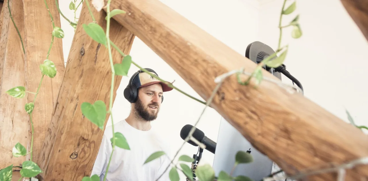
A Bare Wall Behind Tomás: Redesigning His Interview Backdrop
Tomás hosted a weekly interview show against a flat white wall. This short case follows how a few sketches of shelves and panels gave his frame depth without clutter.
A flat wall and a good microphone
Tomás came to the course with a clear complaint. His interview show sounded fine, but on screen his guests looked as if they were sitting in front of a hospital corridor. The wall behind them was white, evenly lit and entirely empty, and the only decoration was a light switch that crept into the left edge of the frame.
He had tried fixing it the way many hosts do: he bought a large print, hung it dead centre and hoped for the best. The result looked like a poster taped behind a speaker. When he sent me his room photographs and measurements, I could see the real issue straight away. Nothing in the frame suggested distance, so the guest and the wall seemed to occupy the same flat plane.
What we noticed before drawing anything
Before sketching, we looked at what the camera would actually see. Tomás had shot his room from the guest chair, which is the viewpoint that matters, and noted where the window light fell in the afternoon. The wall measured roughly eleven feet wide, but his lens only caught about five feet of it behind the guest.
That narrow slice changed everything. There was no need to dress the whole wall. We only had to design the strip that appears on camera, plus a little margin for a guest who leans or shifts. This is one of the first habits we teach in the background modules: plan the frame, not the room.
- Photograph from the guest's seat, not the host's
- Mark the edges of the visible area with tape
- Note where window light lands at recording time
Sketching depth with shelves and a panel
Our first sketch placed a low open shelf at the right of the frame and a vertical wood-slat panel at the left. The shelf gave Tomás a surface at a different depth from the wall, which is what creates that gentle sense of space behind the speaker. The panel added a texture that the camera reads as warmth rather than decoration.
We kept the centre behind the guest's head quiet on purpose. A common beginner mistake is to put the busiest object exactly where the face sits, so the eye fights the speaker. Tomás drew three versions on paper, and we compared them by covering the sketches with a rectangle the shape of his frame.
Editing the shelf down to what earns its place
Tomás's first shelf list had fourteen items. By the end of our review it had six: two books with calm spines, a small ceramic vase, a lamp with a warm shade, a trailing plant and a single framed print leaning rather than hanging. Each one had a reason to be there, either colour, height variation or a link to his topic of local food writing.
We also checked every object for reflections and for bright logos, which can pull attention away from a guest. The lamp stayed because its glow was soft and it sat just outside the strongest window light. Priya's props lessons cover this editing step in more detail, but the rule is simple: if you cannot say why an item is in shot, remove it.
The test recording and small corrections
Tomás built the setup over one quiet Saturday, following his sketch and a short layout note. He recorded a two-minute test with a friend sitting in for a guest and sent me a still frame. The depth was there, but the panel sat slightly too close to the guest's shoulder and made the left side feel heavy.
Moving the panel about eight inches back fixed it. He also lowered the shelf by one board, so the tallest plant no longer touched the top of the frame. These were small changes, and they only showed up because he tested before the first real interview. We encourage every learner to record a short trial and look at it on a phone screen, since many viewers will watch it there.
What stayed the same afterwards
The wall is still modest and the budget stayed small. Tomás did not repaint or rebuild anything permanent. His show now has a frame that looks settled, and guests comment that the room feels like a place where a conversation could happen, which is what he wanted from the start.
What I take from his case is how little it took once the visible strip was identified. Two pieces at different depths, a quiet centre and a short, edited shelf did the work. He has since started sketching a second layout for a seasonal change, using the same method he learned in the background design module.
Tomás's backdrop shows that depth behind a speaker comes from a few considered choices, not from covering a wall. Look at what the camera truly sees, keep the area behind the face calm, place pieces at different distances and edit the shelf until each item has a reason. Then record a short test and adjust. If your own wall feels flat, begin with photographs from the guest's chair and a rough sketch on paper.
Keep reading
-
Autumn Props: Choosing Objects That Earn Their Place in Frame
As the light turns warmer and rooms feel cosier, this is a good moment to review the books, plants and lamps behind you and keep only what has a reason to be in shot.
-
Layout Plan and Setup Day: Plan on Paper or Style in the Room
Two ways to move from concept to finished set: refine a scaled layout plan on paper first, or rearrange furniture directly in the room. A comparison, with a recommendation.