
The Few Materials We Reach for When Styling a Shelf Behind a Speaker
A look at the books, plants, lamps and objects we rely on in the props module, and the simple tests that decide whether an item earns its place in the frame.
Why we start with a short list of materials
When learners first style a background, the instinct is to gather everything that looks nice and see what survives. In the props module we do the opposite. We begin with a small kit of material types and ask each one to justify itself against the camera, the guest and the topic of the conversation.
The kit is deliberately plain: books, a living or convincing plant, one or two lamps, a few ceramic or wooden objects, and something with texture such as a woven basket or a folded throw. Nothing in it is rare. What matters is that each category does a different job in the frame, so you can see at a glance what is missing rather than what is excess.
Working this way also keeps the budget calm. Most learners already own half of what they need, and the exercise becomes one of editing a home or office shelf rather than shopping for a set.
Books as colour blocks and quiet texture
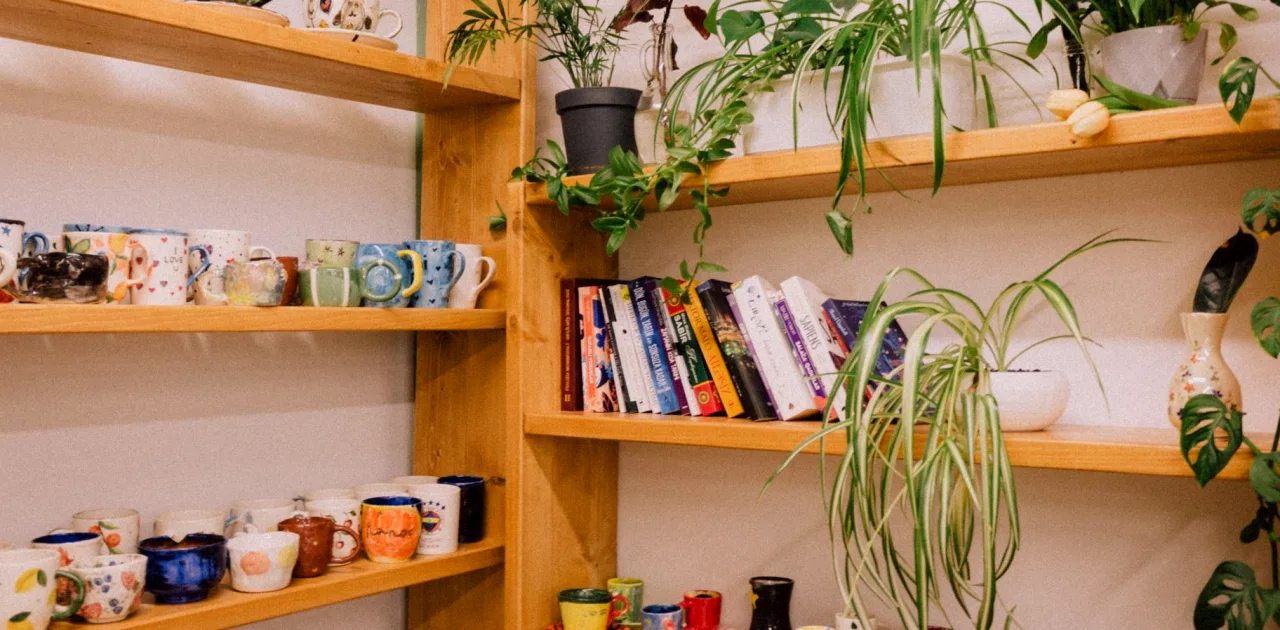
Books are the most useful prop we teach with, but not for their titles. On camera, a spine is a rectangle of colour and a little typography, and a row of them gives the eye a gentle rhythm behind a speaker's shoulder. We ask learners to pull books out and sort them by spine colour, then keep the ones that sit inside a warm neutral palette.
Stacking matters as much as standing. A short horizontal pile next to a vertical group breaks the monotony of a single line, and a small object resting on top gives a point of interest without adding clutter.
We also check spines for anything distracting: bright logos, loud lettering, worn tape. Turning a book around so the pages face out is a perfectly good solution, and it reads as soft cream on camera.
- Sort by spine colour before arranging
- Mix standing groups with one horizontal stack
- Turn away any spine with loud lettering
Plants and the question of living versus artificial
A plant adds softness to a frame that is otherwise made of straight lines, which is why we ask for one in nearly every concept. Daniel often points out during colour critiques that green is a stabilising note against warm neutrals, and it rarely competes with skin tones the way a saturated accent would.
Living plants are our first recommendation, but only if they suit the room's light and the person who will water them. A drooping leaf in the middle of a long interview is more noticeable than people expect. For rooms with little daylight, a good artificial plant works, provided it has varied leaf shapes and a matte finish.
Placement is a camera decision, not a decorating one. Trailing plants belong on a shelf edge, upright ones beside the speaker, and nothing should grow directly out of anyone's head from the camera's point of view.
Lamps: shape, bulb and the glow they add
Practical lamps do two things in a frame: they add a pool of warm light and they act as a sculptural object. We teach learners to judge them separately. First, does the shade shape look good as a silhouette against the wall? Second, does the bulb inside suit the colour of the rest of the room?
A small table lamp on a shelf, switched on at a low setting, creates depth behind the speaker and reads as a soft highlight. We recommend bulbs in a warm white range so the glow matches the palette, and we show how a lamp that is too bright will flare on camera and pull attention away from the face.
Cables are part of the material list too. A cord running down a wall is an easy detail to miss and a hard one to ignore once seen, so we practise routing it behind furniture or using a cable cover painted to match.
- Judge silhouette and bulb separately
- Keep bulbs in a warm white range
- Hide or paint cables before recording
Ceramics, wood and the objects that earn their place
Objects are where learners most often lose discipline. A bowl, a wooden block, a small vase, a framed print: each is lovely alone, and together they can read as a shop display. Priya's test is simple and we use it throughout the module: can you say, in one sentence, why this item is in shot? If the answer is only that it was nearby, it goes back in a drawer.
Good reasons are modest. A ceramic piece repeats the colour of a cushion, a wooden object adds a warm grain that echoes the floor, a small print hints at the topic of the show. Each of these ties the object to something else in the frame.
We also teach grouping in odd numbers and varying height, so three objects are never lined up like a queue. Leaving empty shelf space is part of the method, and it is often what makes the arrangement feel calm.
Checking the arrangement through the lens
The last method is the least glamorous and the most reliable: look at your own shelf through the camera you will actually use, at the lens height and distance you will actually record. A shelf that seems balanced in person can crowd a corner of the frame once the lens crops it.
We ask learners to take a still, view it on a screen, and then squint or reduce it to a small thumbnail. Anything that jumps out of the thumbnail is either a deliberate focal point or an accident, and the exercise helps tell the two apart.
From there, changes are small: move one object, swap one book, lower a lamp. We encourage learners to photograph each version and keep the notes in their layout file, so the final setup is repeatable and anyone helping on recording day knows where things go.
- Test at the real lens height
- Review a small thumbnail of the still
- Photograph and note each change
The materials we rely on are ordinary on purpose: books, a plant, a lamp, a handful of objects and the habit of checking the frame through the lens. Each earns its place by repeating a colour, adding texture or hinting at your subject. Start with the short kit, edit hard, and keep what you can explain. A calm, welcoming background usually comes from that discipline, not from owning more things.
Keep reading
-
How to Build a Warm Neutral Palette and Mood Board for Your Set
A step-by-step guide to choosing a warm neutral palette and assembling a mood board that suits your guests, your topic and the way your camera sees colour.
-
How Deep Should a Backdrop Be? A Question We Hear Every Week
The question we hear most about background design is how much to put behind the speaker. Here is a plain answer built around depth, spacing and restraint, with a few ways to test it.