
How to Build a Warm Neutral Palette and Mood Board for Your Set
A step-by-step guide to choosing a warm neutral palette and assembling a mood board that suits your guests, your topic and the way your camera sees colour.
Start with what the camera actually sees
Before you pick a single colour, look at your frame on the screen you will record with. A wall that feels creamy in person can turn grey or yellow on camera, depending on the lens, the white balance and the lamps in the room. I ask learners to take one still from their usual recording position and keep it open while they work, because every choice that follows is judged against that image, not against memory.
Note which surfaces take up the most space behind the speaker. Usually it is a wall, a shelf unit or a curtain, and these large areas set the mood far more than any small object. Write down their current colours in plain words, such as pale sand, dull white or dark wood, so you have a starting point you can improve step by step.
Check the frame at the hour you usually record. Morning window light is cooler than evening lamp light, and your palette has to hold up in both if your schedule varies.
- Capture a still from your real recording position
- Name the three largest surfaces and their colours
- Check the frame at the time of day you record
Choose a base of three or four warm neutrals
A warm neutral palette works best when it is small. Pick one light tone for the largest area, one mid tone for furniture or panels, and one deeper tone for contrast, then add a fourth only if the frame feels flat. Think oatmeal, soft clay, warm stone and a muted brown rather than pure white and black, which tend to clip or glare on many cameras.
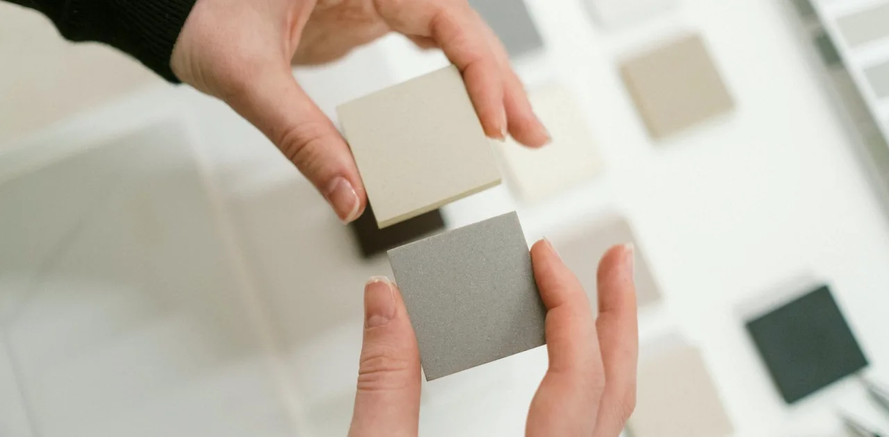
Keep the undertones consistent. If your light tone leans yellow, the mid and deep tones should lean the same way, otherwise the frame looks accidentally mismatched even when each colour is pleasant alone. Hold paper swatches side by side under your actual lamps and judge them together, never one at a time.
Leave room for the speaker. Skin tones and clothing are part of the palette, so a guest in beige against a beige wall will fade out. A slightly deeper background than the typical clothing colour usually separates people cleanly.
Fit the palette to your guests and your topic
The same colours do not suit every show. A quiet conversation about family history invites softer, lower-contrast tones, while a brisk interview about local business can carry a little more definition. Decide in one sentence what the viewer should feel in the first few seconds, and let that sentence guide which neutral leads.
Think about the range of people who will sit in your chair. If you host different guests each week, avoid colours that clash with common clothing such as navy, olive or patterned shirts. A calm mid tone behind them gives everyone a fair start and spares you from asking guests to change outfits.
If your topic has a natural visual cue, such as books, gardens or music, let it suggest an accent. One small accent colour, repeated twice in the frame, is usually enough to tie the set to the subject without turning it into a theme.
- Write one sentence describing the intended feeling
- Test the palette against dark, light and patterned clothing
Assemble the mood board in a single sitting
A mood board is a working tool, not a collage for its own sake. Gather paper swatches, fabric offcuts, a photo of any furniture you already own, and a few reference images of frames you like. Arrange them on a table or a sheet of card in the proportions they will have in the room: a lot of the light tone, less of the mid tone, a little of the deep one.
Keep the board to one surface about the size of a large tray. When it grows beyond that, decisions become vague. Label each element with where it will go, such as back wall, shelf, armchair or lamp shade, so the board reads like a plan rather than a pile of inspiration.
Photograph the finished board in the same light as your recording space and compare it with your frame still. If the board looks right but the still looks off, the room is the problem to solve, and now you know exactly which surface to change.
- Use real swatches and offcuts, not only screen images
- Label every element with its place in the room
- Photograph the board in your recording light
Test before you commit to paint or furniture
The cheapest mistakes are the ones made on paper. Tape a large swatch or a sample card to the wall behind your speaker and record a short test clip. Watch it on the device your audience is most likely to use, often a phone, since small screens exaggerate contrast and flatten subtle differences between neighbouring tones.
Leave the sample up for a couple of days and glance at it in morning and evening light. A colour that looks soft at noon can turn heavy by lamp light, and it is far easier to change a card than a painted wall. If you rent your space, fabric panels or a hung throw can stand in for a trial.
Take notes on each test: which clip, which light, what you noticed. After two or three rounds a pattern appears, and the right palette usually announces itself without any need for guesswork.
Common slips and how to avoid them
The most frequent slip is choosing colours from a screen or a catalogue and never from the room itself. Printed and digital colours shift under real lamps, so always judge from physical samples in your own space. The second is using too many tones, which makes the frame busy even when every object is tidy.
Another slip is ignoring the floor and the edges of the frame. A bright rug or a strongly coloured door at the side can pull the eye away from the speaker. Look at the whole rectangle, not only the wall behind the head, and soften anything that competes.
Finally, do not treat the board as final. After a few real recordings, adjust it. A calm, consistent look comes from small corrections made over time, and a good mood board leaves space for them.
- Judge colour from samples in your own room
- Limit the palette to three or four tones
- Check floor, doorways and frame edges
A warm neutral palette is a set of small, careful decisions: look at the real frame, keep the tones few and consistent, fit them to your guests and topic, and test before you commit. Build your board from physical samples, label where each one goes, and revise after a few recordings. The result is a space that feels composed and welcoming without any effort showing on screen.
Keep reading
-
Autumn Props: Choosing Objects That Earn Their Place in Frame
As the light turns warmer and rooms feel cosier, this is a good moment to review the books, plants and lamps behind you and keep only what has a reason to be in shot.
-
A Bare Wall Behind Tomás: Redesigning His Interview Backdrop
Tomás hosted a weekly interview show against a flat white wall. This short case follows how a few sketches of shelves and panels gave his frame depth without clutter.
-
What We Changed in the Background Design Module This Autumn
Marisol Vega explains how the Background Design module now moves from wall photographs to simple sketches of shelves and panels, so the space behind the speaker has depth without clutter.