
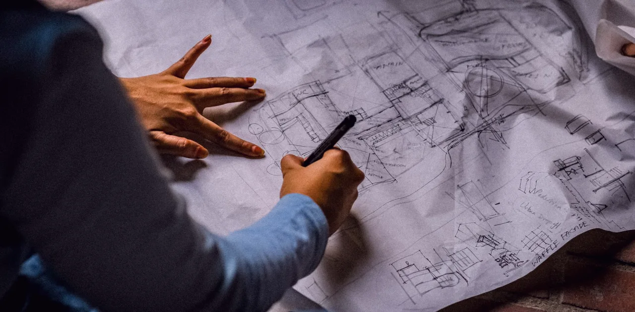
What We Changed in the Background Design Module This Autumn
Marisol Vega explains how the Background Design module now moves from wall photographs to simple sketches of shelves and panels, so the space behind the speaker has depth without clutter.
Why the module was reworked
Over the past year, the questions learners sent us about Background Design kept pointing at the same gap. People could describe the look they wanted, a calm wall with a little depth, but they struggled to turn that wish into something they could build or buy. So this autumn I rebuilt the module around a single idea: start from what the camera actually sees, and sketch only that.
The earlier version spent a lot of time on general inspiration. The new one is shorter on theory and longer on drawing. Each lesson now ends with a sketch you can keep, and each sketch is tied to a real room photograph and a few measurements, the same ones you gather in the Reading Your Room module.
If you have already worked through that first module, you will recognise the rhythm. Photograph, measure, note what falls inside the frame, then decide what the wall behind the speaker should do.
Starting from the wall, not the shelf
The first change is the order of work. Learners used to begin by choosing furniture and objects and then look for a place to put them. Now the lesson opens with the bare wall: its colour, its texture, where the light lands on it and how much of it shows behind a seated guest. Only after that do we ask what it needs.
Often the honest answer is very little. A plain wall in a warm neutral can look composed on its own, and one well-placed element can be enough. We practise judging that restraint with a short exercise where you mark the usable area on your photograph before adding anything.
This keeps the design proportionate to the room. A small spare room and a larger office need different amounts of structure behind the speaker, and the sketch should show that difference.
- Photograph the wall straight on, at camera height
- Mark the area that stays visible on camera
- Decide what the empty wall already does well
Shelves, panels and wall treatments in sketch form
The central part of the module covers three kinds of element: shelves, panels and wall treatments. Shelving gives the eye something to travel across, panels add vertical rhythm and soften hard surfaces, and a treatment such as paint, fabric or slatted texture changes the mood of the whole wall. Each has its own lesson with a worked sketch.
We draw them at a simple scale, usually a quarter inch to a foot, so that proportions stay honest. A shelf that looks charming on paper but fills half the frame is the sort of problem we want you to catch before anything is bought or built.
I ask learners to draw two versions of every idea, one fuller and one pared back, and then compare them against the original photograph. The comparison teaches more than any rule I could give you.
- Shelf depth and spacing drawn to scale
- Panel width against the visible wall
- Texture and colour chosen from your own palette
Creating depth without clutter
Depth is the reason people want a designed background at all. A speaker pressed against a flat wall looks pasted onto it, while a little distance and a few layers make the picture feel like a place. The module teaches three simple layers: the wall, one mid-level element such as a shelf or panel, and a small foreground detail near the speaker.
Clutter appears when every layer tries to say something. We use an editing pass, borrowed from how Priya teaches props, where you remove one item at a time from the sketch and see whether the frame suffers. If it does not, the item goes.
The result is a background that holds attention gently and leaves the guest as the focus. That is the standard we keep coming back to in every lesson.
What you will have by the end
By the end of the module you will have a background sketch for your own room, built from your photograph and measurements, with shelves, panels or a wall treatment placed deliberately and checked against the camera view. You will also have a short note listing what to keep, what to remove and what to try first.
This feeds directly into the later modules. Furniture Placement uses your background sketch to position seating, and the Layout Plan and Setup Day module brings everything together on one scaled drawing.
The module asks for no special skills. If you can hold a pencil, use a tape measure and take a photograph with a phone, you have everything you need to start.
A note for the coming weeks
Early autumn is a good moment to look at your recording space. The light in most rooms is changing, softer and lower, and the wall behind you will look different at the hours you usually record. I suggest taking your wall photograph at that time of day before you begin the module.
Many learners find that a background they were happy with in summer reads cooler or flatter now. Noticing this early saves rework later, and it gives your sketch a more truthful starting point.
If you are unsure where to begin, the Contact page is the place to ask a question about the module before you start. We are glad to point you to the right first lesson.
The reworked Background Design module is smaller in ambition and clearer in method: photograph the wall, measure what shows, sketch with restraint and compare options against the camera view. If you take only one habit from it, let it be the editing pass, removing one item at a time until the frame still works. A calm, layered background is built more from good decisions than from many objects.
Keep reading
-
Two Chairs, One Awkward Gap: A Furniture Placement Case
Nadia hosts a weekly interview show from a narrow spare room. Here is how moving two chairs, not buying new ones, changed how she and her guests look on camera.
-
A Colour and Mood Board Checklist to Run Through Before You Commit
Before you settle on a palette for your recording space, work through these checks on guests, topic, camera and light, so the board you choose still looks right on screen.